Terra Kaffe | Social Ad Campaigns
Programs: Photoshop, After Effects, Illustrator, Figma
Role: Art Director, Graphic Designer, Motion Designer
Terra Kaffe wanted to challenge the assumptions behind single-use coffee pods by highlighting their environmental impact, waste generation, and freshness limitations. Rather than creating a traditional sustainability campaign, I developed a social-first creative system designed to provoke conversation and encourage users to reconsider the tradeoffs behind pod convenience.
The Challenge
Most sustainability messaging in the coffee space tends to feel predictable and easy to ignore. The challenge was creating content that could break through crowded social feeds while still communicating legitimate product and environmental concerns.
The solution was to embrace a "rage bait" approach using provocative messaging, bold visual hierarchy, and unexpected imagery to stop users mid-scroll and encourage engagement.
Rage Bait Static Campaign Series
Release 1: Anti-Pod Fact System
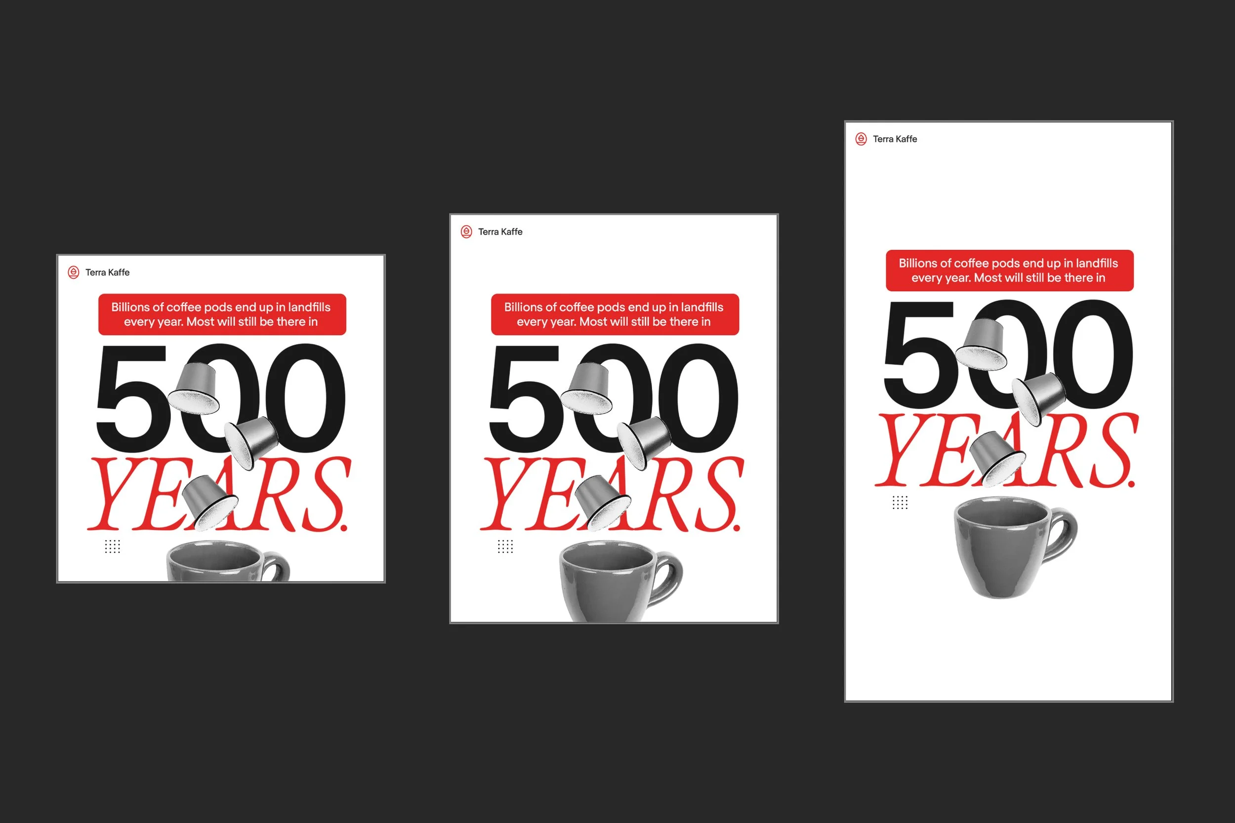
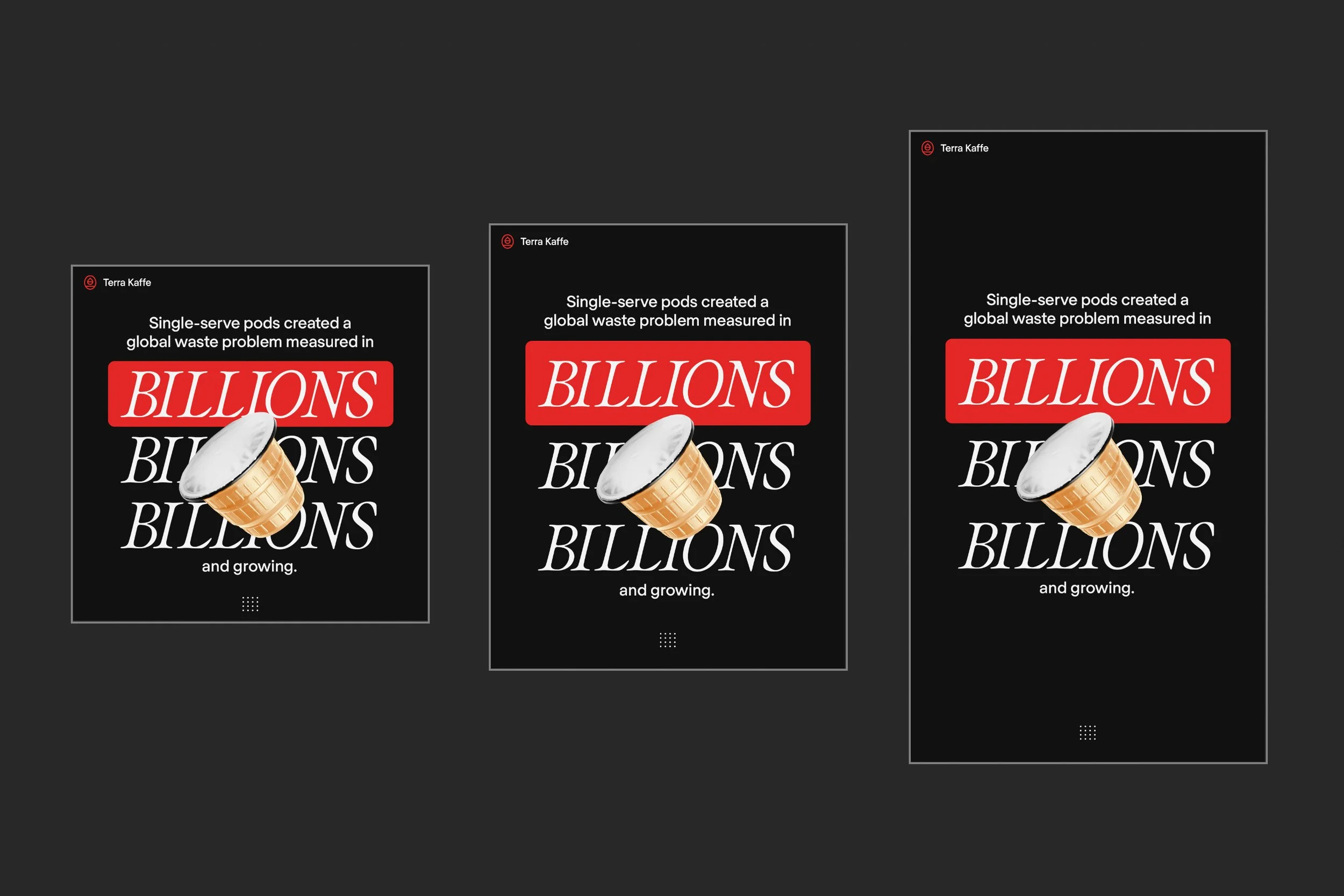
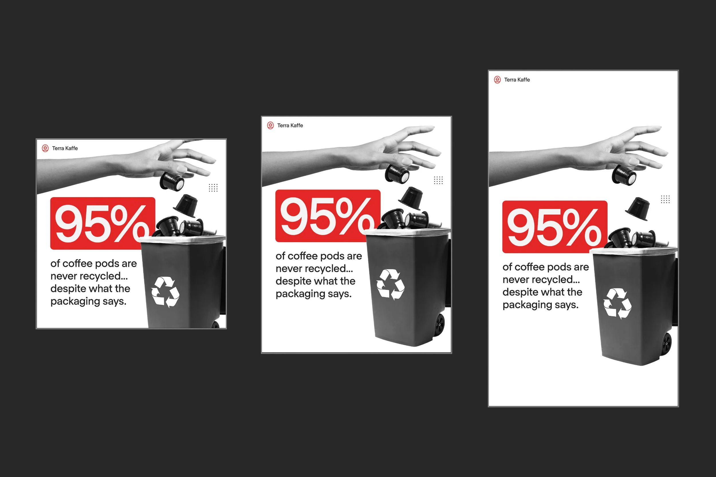
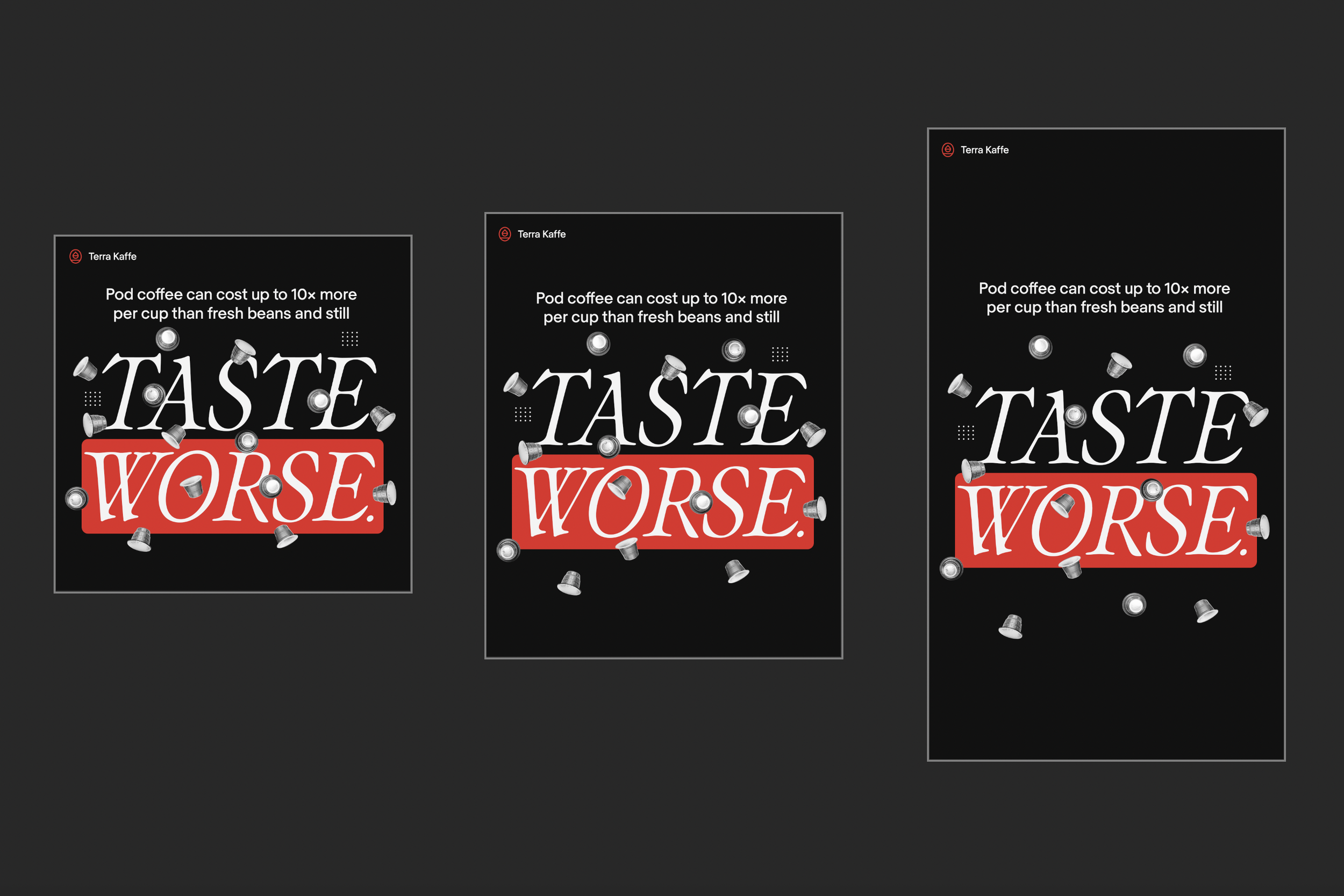
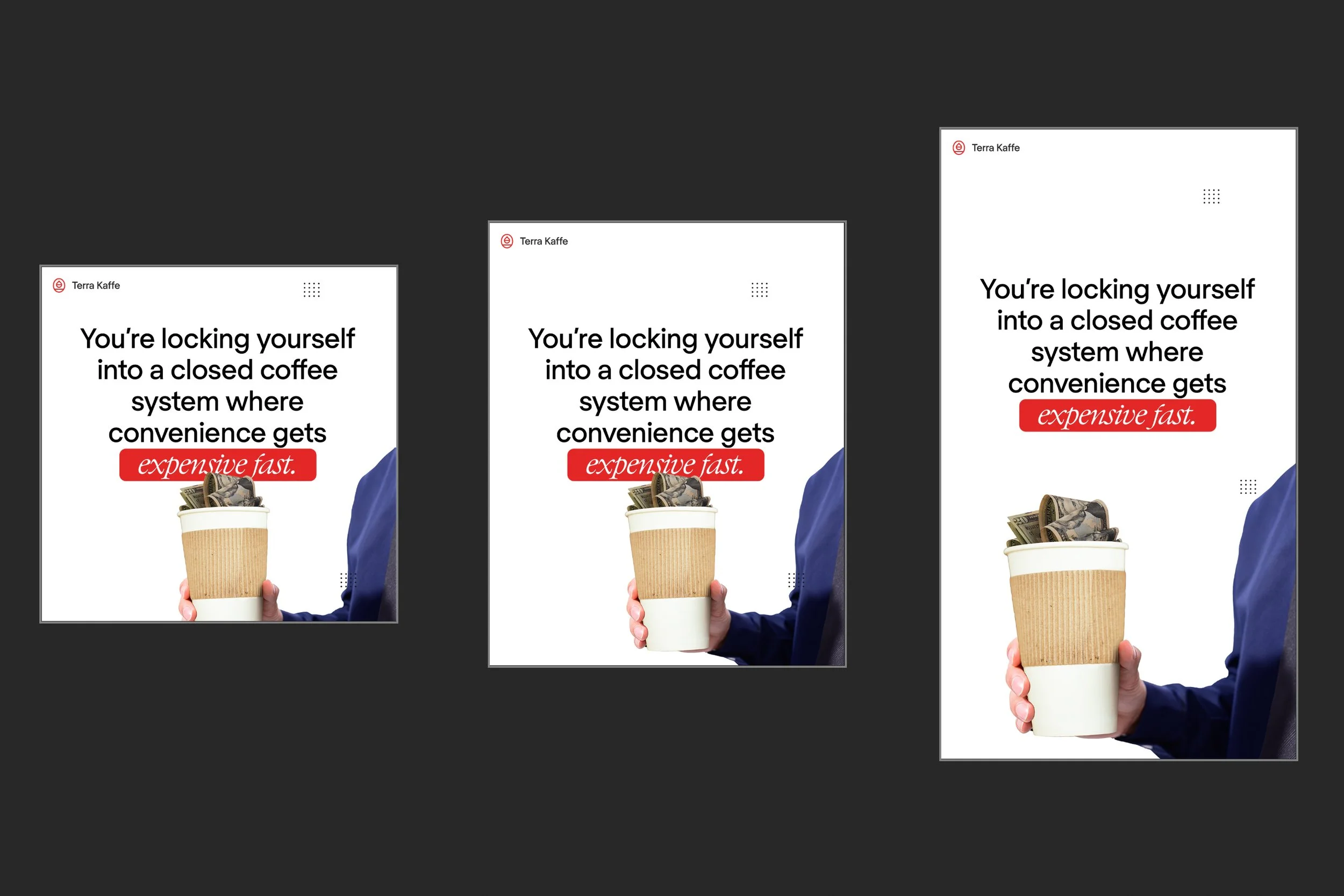
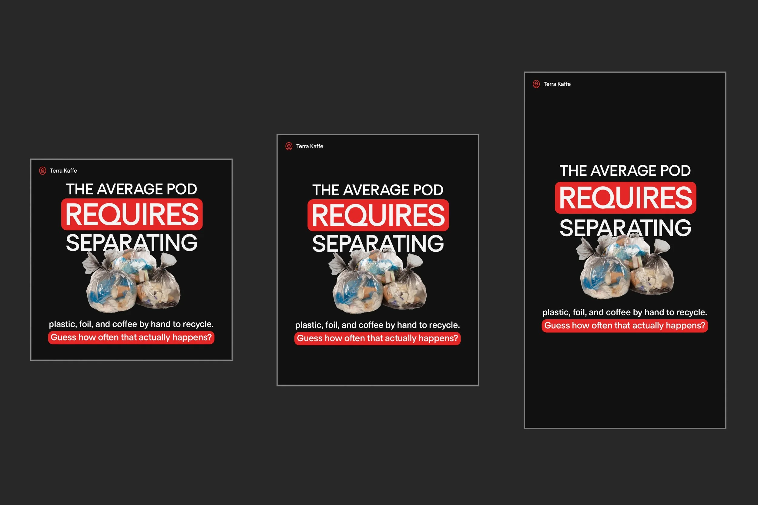
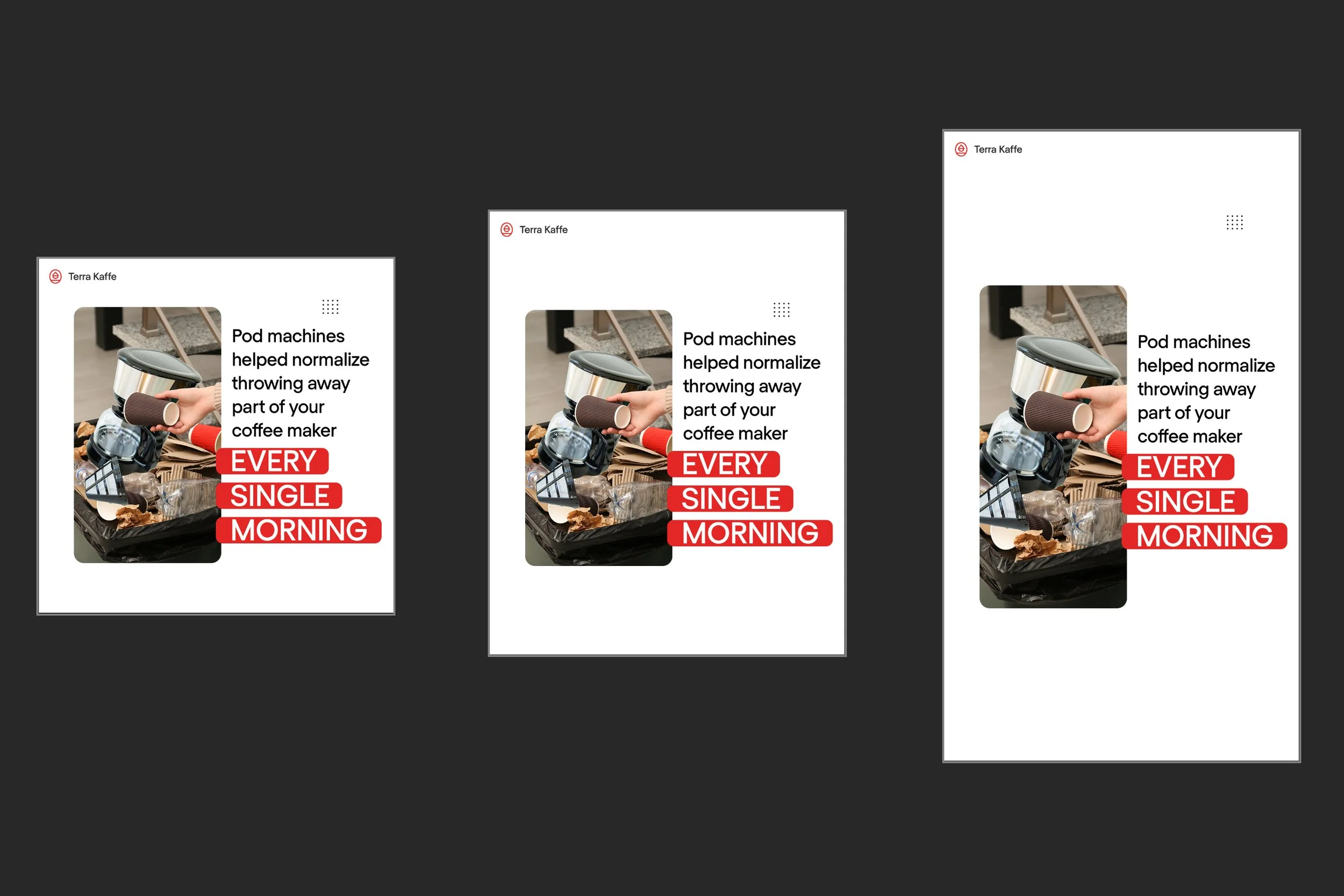
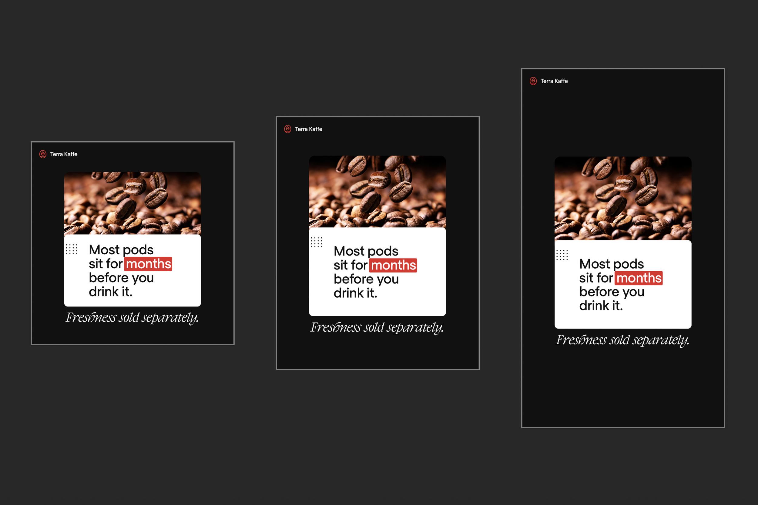
The first phase focused on presenting environmental and product-related facts through a visually direct, high-contrast design system.
Design Approach:
I intentionally limited the color palette to black, white, and Terra Kaffe's signature red. Most supporting photography was converted to black and white, allowing the red elements to become the primary focal point.
Because the campaign messaging was highlighting negative aspects of pod coffee, the red color took on a dual role: reinforcing Terra Kaffe's existing brand identity while simultaneously functioning as a visual warning signal. The result created an immediate emotional association between the facts being presented and a sense of caution or urgency.
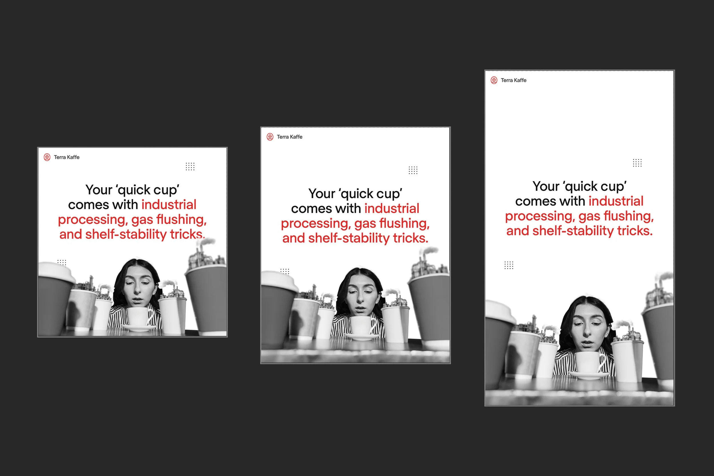
While some executions were straightforward using simple imagery of coffee pods and waste, others used exaggerated visual metaphors to strengthen the message.
Examples included:
A giant hand disposing of pods into a full-size trash container to emphasize the cumulative waste generated by seemingly small daily habits.
Coffee cups composited with industrial factory imagery to contrast the perception of a simple, convenient cup of coffee with the larger manufacturing and environmental systems required to produce disposable pods.
Outcome Notes:
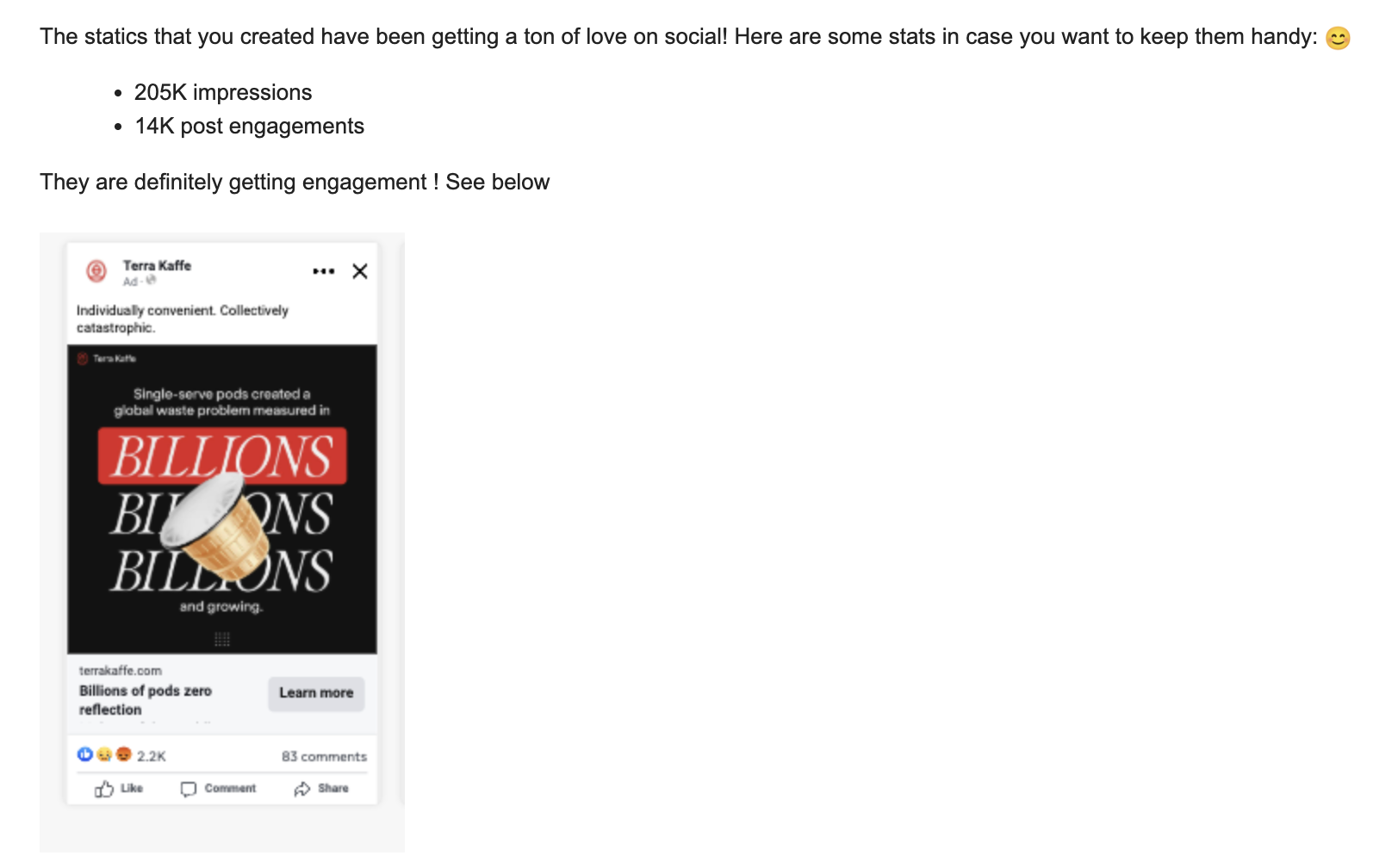
Strong engagement driven by “shock clarity” messaging, encouraged discussions
In the first two weeks the posts had:
- 205K impressions
- 14K post engagements
Release 2: Pod Hazards
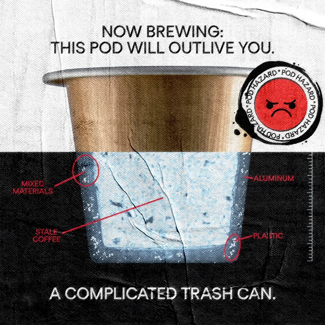
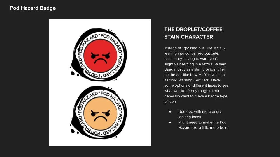
I shifted from direct information delivery toward a more conceptual visual language inspired by vintage public safety campaigns and educational posters, most notably the old “Mr. Yuk” poison warning ads. A badge was developed as a pseudo “warning icon” for pod coffee, translating abstract environmental concerns into a recognizable visual signal.
Design Approach:
I was particularly interested in the visual authority of 1970s and 1980s public service announcements. Those campaigns communicated serious messages using simple graphics, bold colors, and memorable warning symbols. The goal was to make the campaign feel like a rediscovered public awareness initiative rather than a contemporary advertisement.
To recreate that feeling, I introduced:
Distressed paper textures
Fold marks and wrinkles
Wheat-pasted poster treatments
Vintage print imperfections
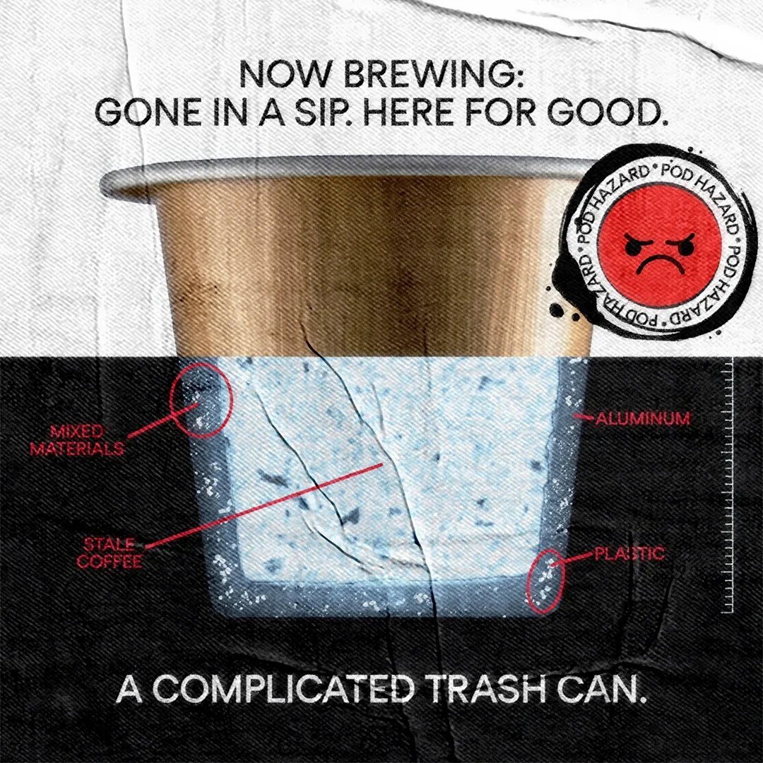
The "Podtopsy"
One of the lead visuals from the campaign was a piece I called the "Podtopsy." The concept treated a coffee pod as if it were being examined in a medical or forensic setting. The composition split the pod into two distinct visual states: one side presenting the familiar exterior, while the other revealed a stylized x-ray-like cross-section exposing elements typically hidden from consumers, including packaging materials, pod construction, and aging coffee grounds.
Pod Fossil
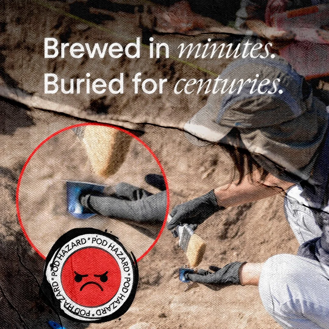
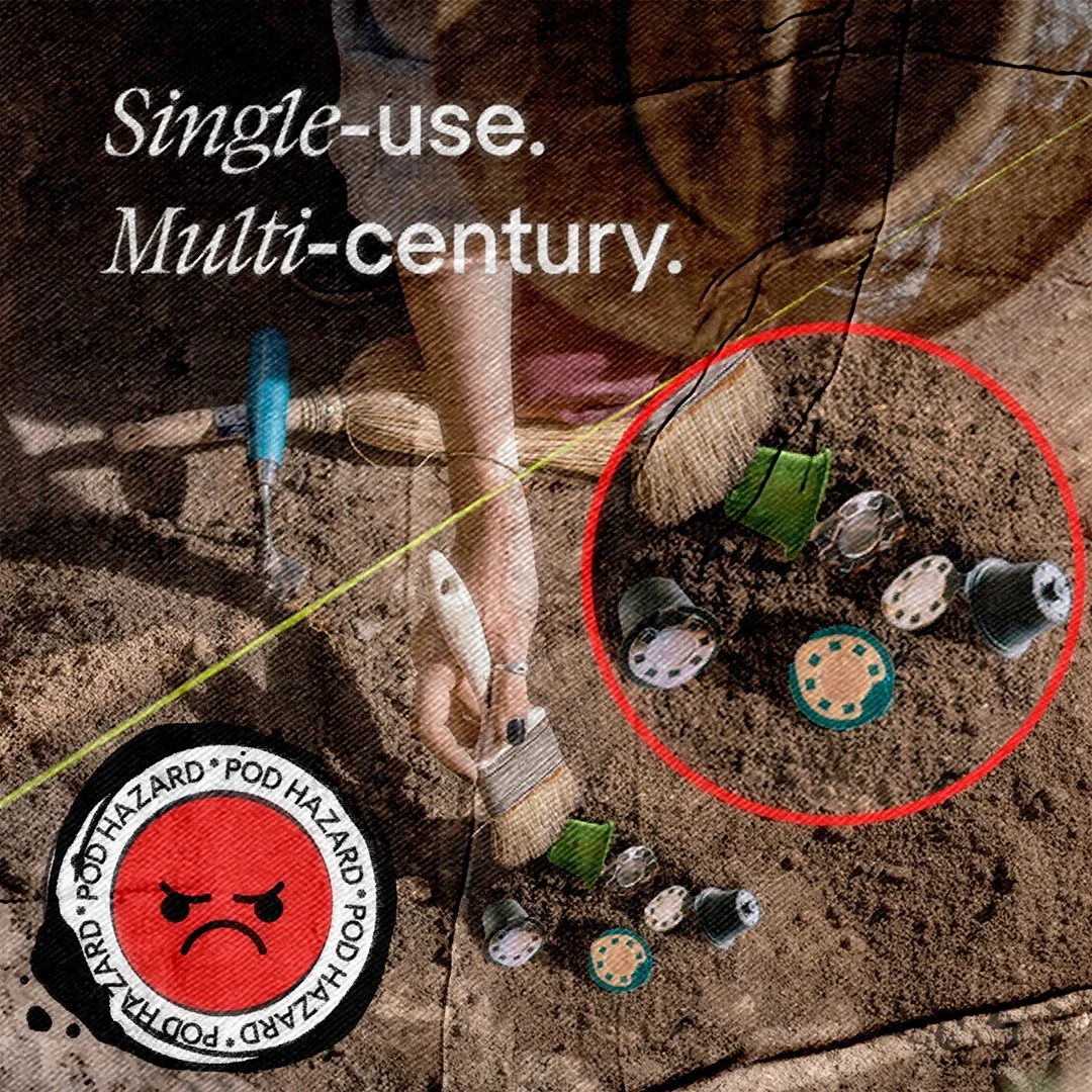
The concept was inspired by the reality that many coffee pods can persist in landfills for decades or even centuries. Rather than showing waste in a contemporary setting, I wanted to visualize the long-term consequence of a seemingly insignificant daily habit by imagining a future archaeological excavation site where discarded coffee pods are being unearthed like fossils.
Takeaway
This project explored how sustainability messaging can become more effective when treated as a branding and storytelling challenge rather than a purely educational one. By combining provocative copy, symbolic imagery, and retro warning aesthetics, the campaign transformed product facts into a more memorable and engaging social experience.

Animated Explainer Video
A quick turnaround, short-form motion piece designed to show off the Terra Kaffe line and its benefits in a visual way.
